

Selected work / Branding & creative direction
Three projects.
Three visual worlds.
Choose a project and watch the complete page shift into its identity. From album artwork to merchandise and social content, every touchpoint follows one clear visual language.
Swipe left or right to switch projects

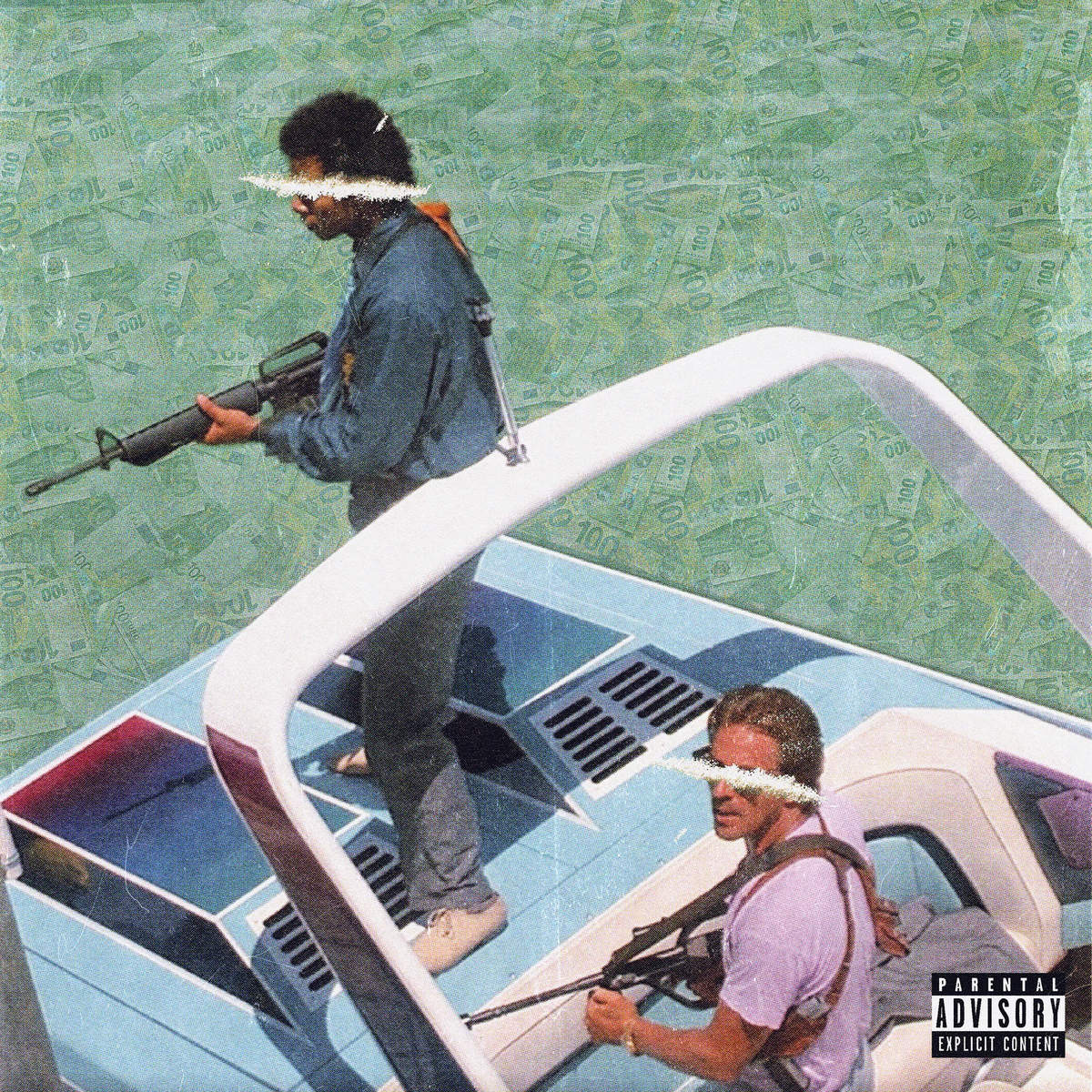
Front cover
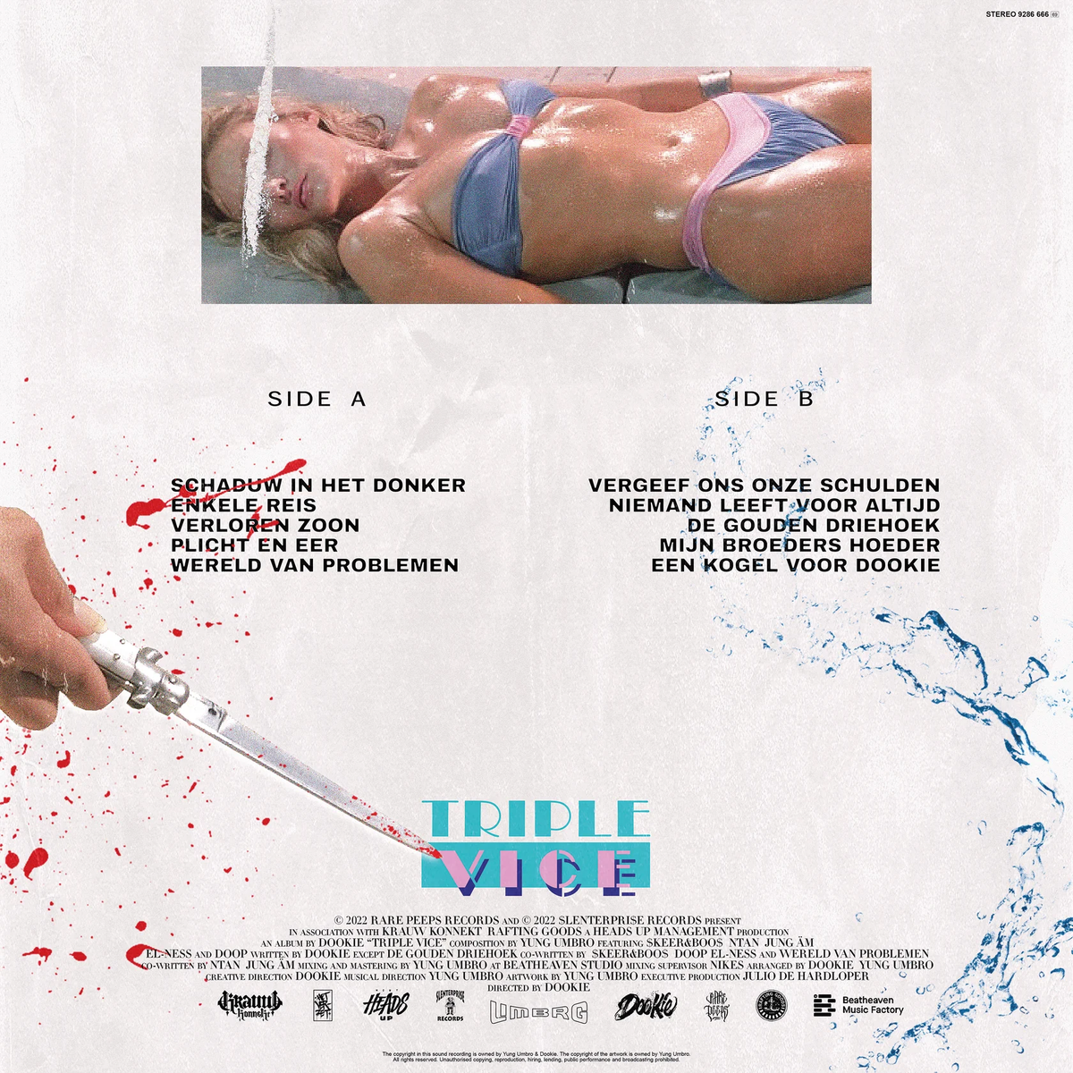
Back cover
01 / Artwork
Miami excess, built into one identity.
Triple Vice is rooted in the visual language of 1980s Miami: neon nightlife, luxury, danger and excess. The title represents three vices, translated on the front cover through weapons, drugs and money. Typography inspired by the iconic Miami Vice logo and the recurring pink-and-blue palette connect the front, back and wider campaign into one cinematic world.
02 / Merchandise
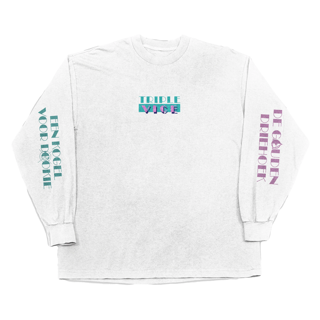
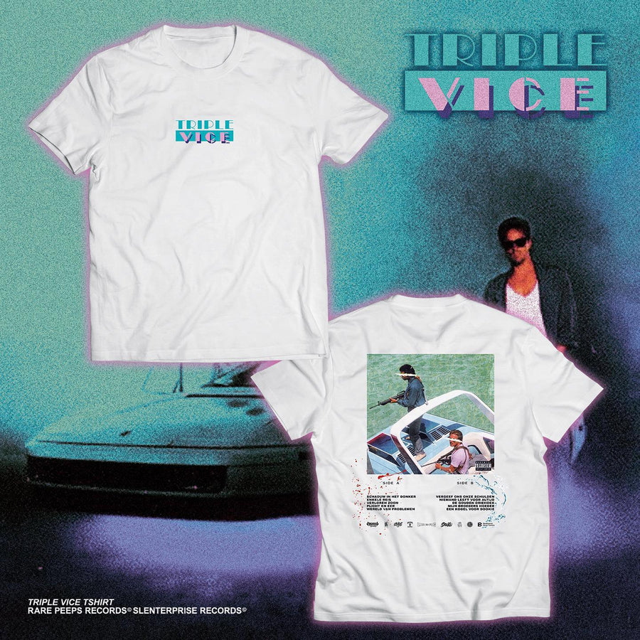
A release identity you can wear.
The merchandise moves the neon colour system and recognisable logo beyond the record sleeve. Strong placement, high contrast and a clear silhouette make the shirt feel like a real part of the Triple Vice universe rather than an unrelated promotional item.
9:41
● ● ●
triple_vviceAlbum identity
03 / Social design
The campaign continues on every screen.
The social rollout keeps the same neon palette, cinematic tension and bold typography. Each post can stand on its own, while the colours and visual cues make the project instantly recognisable as Triple Vice.
Start your branding project
Build a complete visual world.
Whether you need cover artwork, merchandise, social assets or a complete identity, I develop the project from its first feeling to the final rollout.
Triple Viceswipe within any section